Pizza Time
Summary:
Pizza Time is a beloved North West staple, supplying quality pizza at an affordable cost. An independent family-run take out and delivery pizzeria, Pizza Time first opened its doors in 1988, and has since served as a popular family dining establishment in my own home state of Washington. It is because of my own appreciation for this small, family-run business that I can personally attest to the poor user experience when ordering from the Pizza Time website.
.png)
Date :
June to August 2023
Role:
Lead UX Designer, researcher
Goals
Improve the appearance and user flow of the Pizza Time website by....
-
Conducting a current usability study to locate user issues and poor flow performance
-
Strategizing a plan to improve user experience
-
Conducting preliminary user research
-
Creating affinity maps to locate common themes/trends in user needs and desires
-
Creating personas to further empathize with the common user
-
Building an information architecture to better organize the current website structure
-
Begin lo-fi sketches in order to ideate and initiate the design process
-
Transition to lo-fi prototypes in order to test usability and flow
-
First usability study to test functionality and design
-
Finalize designs with hi-fidelity prototypes
-
Conduct a secondary usability study to ensure functionality
Personal goals:
-
Improve experience using Adobe XD
-
Prove efficiency in locating user flow issues and recreating designs using UX/UI elements and practices
-
Utilize my ability as an illustrator/design to create my own buttons, designs and icons in Adobe Photoshop and Illustrator
Note: I have noticed over my time in UX that I have a strong preference for Figma. I would like to challenge myself to improve my capabilities with Adobe XD. Therefor, I will be utilizing Adobe XD only during the course of this project.

Challenges
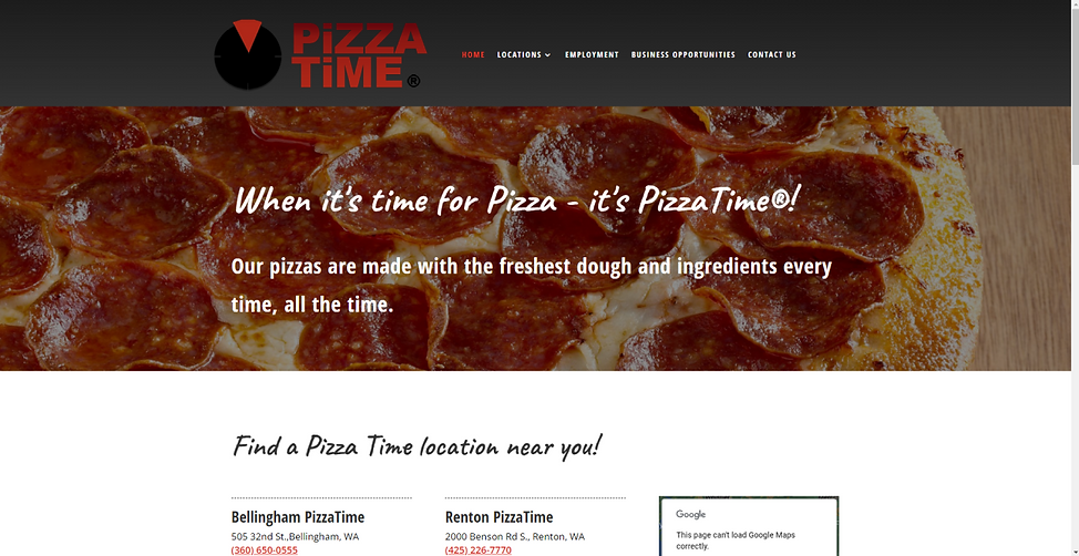
The original Pizza Time website design provides a number of challenges. Aesthetically, the design is just okay--however, from an objective perspective, most users would not have a particular issue with the website appearance. Although we will be making adjustments to the aesthetic appeal of the website, our main focus is the functionality. The Pizza Time website shows little functionality; its main purpose is to redirect to local websites in which users can order online in their area. Furthermore, the website offers information about locations, employment, business opportunities, and a Contact Us form. Our main goal in this project is to streamline the website so that orders can be made directly from the landing page, without having to redirect to an entirely new website.
After a redirect to a local branch, we can now order online (as seen above.) However, the user experience here still lacks appeal. Users must scroll down to reach the most vital components of the website. The color scheme (though chosen understandably to match the colors on a pizza) is not complimentary and causes a feeling of inconsistency.
Once a user has access to the online ordering form, the user experience is vastly improved. Due to that, and for the purpose of this project, we will be focusing primarily on improving the functionality and appearance of the landing page.
Research
Seeing as Pizza Time is a small, family establishment, locating demographic information about this specific business proved to be difficult. Instead, I turned to the Department of Agriculture’s 2007-2010 report on pizza consumption in the U.S.
According to the report, “Consumption of Pizza - What We Eat in America, NHANES 2007-2010”, the largest consumers of pizza are white males, between the ages of 2 and 60. According to this report, females appear to eat far less pizza on average than males. For the purpose of this project (and because children aren't likely ordering pizza online) the main demographic will start at age 18.
Source: What We Eat in America


With that demographic in mind, I reached out to three different consumers who all have experience ordering from Pizza Time. After discussing their personal experiences with the website, they were asked to participate in a usability study on the current functionality of the original website design. Taking their notes, I organized affinity maps to locate common trends.


Pain Points
Though users had many complaints about the website's User Experience, I was able to concentrate their concerns into three main categories: Navigation, Visual Design, and Accessibility/Product Clarity. Users felt the website was a pain to navigate, with redirected sites at every turn. The visual design was lackluster, and users did not enjoy the stock photos, color choices, or font choices. Most importantly, users felt the original site lacked transparency. They complained that they can not see the product on the landing page, and must be redirected in order to access menus, deals/coupons, or photos of the product.

Logo
